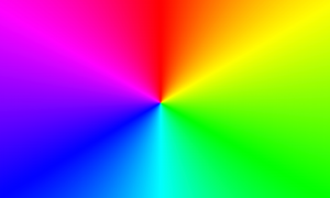
 The image is, I hope, a mathematically accurate colour wheel. It’s a bit confusing to me how the visible spectrum can be made to fold around on itself like this but, for some reason, it does. Red and blue are at opposite ends of the visible spectrum and yet, mix them together and you get an intermediate colour that happens to be at the blue end of the scale to start with but moves to red without passing through intermediate colours – yellow, green and cyan. Mixing paints I can understand well enough – loads of red plus a spot of blue equals purple. Loads of red plus a spot of green equals yellow – not so much. But that is, apparently, how light works. Most, I think all, screen devices use an ‘additive’ colour model based on Red, Green and Blue – the RGB colour model. Add all three together equally and you get white light.
The basis of the other colour model that is most common these days is also represented in the wheel. The model is called CMYK for Cyan, Magenta, Yellow and Key (which means black and is a quick way of making inks darker). Cyan, magenta and yellow are the distinct bands you can see between the red, green and blue. CMYK is a colour model for printing and, in theory, if you add all three together in equal amounts you will get shades of grey through to black. It is a ‘subtractive’ colour process; the more you mix the paints equally, the less light gets away. You mightn’t think it (if you haven’t tried) but, actually, adding yellow and magenta in equal amounts creates quite a decent red. I still can’t believe it myself so I have just mixed some paints from a ‘process set’ of acrylics and there it is. Yellow and pink make red. Back in the day, there was a brand I used to make artwork for that needed lots of block colours. After a couple of tries, I decided that the cyan magenta and yellow came out best because they were the pure inks used by the machines. The reds, greens and blues all looked a little grainy.
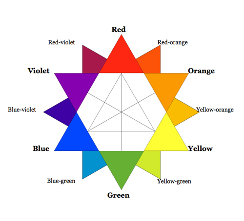
I have difficulty getting my head around the idea of mixing pink and yellow to get red because my mind is telling me that this is wrong, although the fact of where the colours I’m mixing with come in the spectrum does seem genuinely strange to my logic. The real reason that I have difficulty is that I have learned something different. This …
In the words of the Sesame Street song, ‘One of these things is not like the other!’ Red and yellow make orange? They do. Blue and red make purple? They do. Yellow and blue make green? They do. Mix any two complimentary colours together and they make brown? They do. They shouldn’t! If the model were correct, they should make grey. To test this, I’ve just added an equal splodge of cyan to my magenta and yellow mixture from above and, indeed, a pleasing dark grey results.
The reason I come to write this is that I have decided to brush up on my web-making skills after a few years of not developing on a regular basis and I went searching for information on design to put a solid foundation under my usual jump-in-and-have-a-go approach. I read a number of articles on a well-regarded web design resource site about colour theory, palettes, warm colours, cold colours, etc. but was somehow a little put out. Something that a printer had said to me once about screens using a colour model that didn’t even exist came to mind and I decided to look into the matter.
It turns out that the colour star above is not correct in a proportional sense. It’s what’s taught in schools and to many aspiring artists but it, literally, mathematically, does not add up. Of course, it can be made to work in mixing paints. Mix the yellow and blue and you get green so you have three primaries that can, in theory, be mixed to make the gamut. But red and green is brown on anyone’s palette.
There is extensive discussion on Wikipedia’s discussion page on the RYB Color Model with the most recent entry entitled ‘incorrect by what standard’ but the fact remains that as a visual representation of a colour model, exhibit B above is incorrect. There are too many intermediate colours between red and green and too few between green and blue. The clinching argument for me is that, if a colour model contains both primary and complimentary colours, then the complimentary colours in RYB are not right; regardless of whether we can mix them or not. The proportions that we should use don’t add up.
Having read and discovered about the spectrum, gone searching for photos of rainbows (many look more CMY than anything else but it’s really hard to tell real from fake on the web), I went back to visit the web design resource site to look back over the theory – especially about balance, psychological effect, warmth, etc. I really question how it can have validity when the model that underpins it has a mistake in it.
So, does it matter Allin? As always, I wouldn’t be writing about it if it didn’t. To me it is dogma. Not dangerous or offensive but a piece of ‘knowledge’ that is true because commonly accepted even though a more correct truth has been found.
That being said, I recently went to buy paints for make-and-do for the kids. What did I buy? Red, Yellow, Blue, Black and White. Old habits die hard!

