
There are more and more things becoming free every day and it’s easy to see our lives becoming filled with junk, both in the real and virtual worlds. Free fonts are definitely a case in point. Machines come pre-installed with a wide variety of fonts to begin with and there are literally thousands of them available for free – both high quality and not-so-high quality. Some have very extensive character sets and some not-so.
Why you might not want to use free fonts?
For a start, many of them may not be the highest quality in terms of design and readability so you may be better off going with a well-established proprietary font that is well rated by designers. I can claim to know what I like font-wise but don’t really have a qualified eye for evaluating the various working aspects of a font. To some extent, at least, with proprietary fonts, you should be guaranteed quality in terms of design. With free fonts, you take your chances.
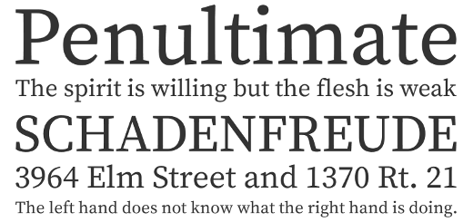
The range of glyphs (characters) in a font set is an important consideration. Many free fonts give only a basic set which might be good for everyday purposes but, for a font that is for everyday use in a company, let’s not condemn our future new colleagues to having their name forever misrepresented just because they happen to be called Françoise or Dvořák.
The range of uses that we might put a font to is also a consideration. Some fonts perform better on screens than they do in print or vice versa. For many fonts, there are now web versions – essentially the same fonts as their print versions but compressed for speed and with additional metadata (information about information). If you are choosing a font and you want to have consistency across all media, then it is recommended that it works in print and electronic display. Some free fonts, as you may have guessed by now, may not fulfil these requirements.
Why, then, might you want to use free fonts?
The first reason, of course, is freedom. Provided that a font works for your current and future needs, you can count on having it for all your projects, on all your machines, feel free to send it to designers, employees, contractors, friends and anyone else you feel like. Proprietary fonts generally come on a per-machine licence so, if you want to stay within the law, everyone that uses it on a different machine needs to have a copy. Proprietary fonts also come in pieces. About $30 is the going rate for your basic font. However, if you want italic, that’s another $30 and bold will set you back another $30. A full font suitcase, as they are called, containing oblique and a range of weights, will set you back around $330 – per machine on which it is installed. You can see that setting typographical consistency across an organisation could soon mount up in cost.
Proprietary fonts for the web also come with their own extra restrictions as to how you can and can’t use them:
[…] 2. License Grant. The Licensed Web Fonts are licensed, not sold, to you for Use only under the terms of this Agreement. MyFonts, as the licensor, reserves all rights not expressly granted to you. You are hereby granted a non-exclusive, non-assignable, non-transferable (except as expressly permitted herein) license to Use the Licensed Web Fonts only on Websites which are owned or controlled by you and only using the @font-face selector in CSS files, subject to all of the following conditions:
… very much etc. etc. Great⸮ (That being a percontation point: the most acceptable punctuation mark for sarcasm and irony, first proposed in the 1580s and still not widely adopted. For those on Android, it’s a backwards question mark. When I find out how to resolve that little issue, I’ll insert the solution here. )
So a good free font will give you the freedom to use it as and how you want. Particularly if it comes with a suitable licence, it also allows you to future-proof your typography. If your needs or technology change, you will most likely be able to adapt the font to suit your needs, even if no-one else has done so already and made the adaptations freely available. Even if your font is unsupported, it would be a relatively inexpensive matter to pay to have it converted or new glyphs added as per your requirements and there is no licence agreement stopping this from happening. There is also safety from changes in technology bringing new versions with accompanying new licences, new restrictions and new costs to continue using what you have already paid for – a particular cost these days of getting caught in unwanted upgrade cycles – you’ve got a new this, you also have to buy a new that because your old that, which worked perfectly well with your old this, doesn’t work with your new this and your old this doesn’t work on the new shiny computer systems you have just installed. Confused? It’s recognisable as the point at which you just pay someone else to sort out the problem!
Why not just use the fonts that come installed on machines as they arrive?
Because they may not be suitable. It’s a perfectly viable option but needs care and consideration in terms of other usages such as web-fonts and their suitability for other purposes. Many of the fonts that come pre-installed on computers are proprietary and are also restricted in use. There is also the possibility that they may become unsupported and unusable at a future date. There are fewer problems with that these days but I do remember the nice Kidprint font on Mac OS9 that I used for the Cork Children’s Chorus but which was unavailable for Windows and, at that time, there were no available converters. Moving up to OSX, the font was gone and I ended up using the much less kiddish MS Comic Sans as a replacement. It was a noticeable change in brand that I hadn’t wanted. (I didn’t know you could buy fonts at the time and have just discovered that it’s available to buy at a mere $49 per variant.)
I have to say that, for myself, I have used Times New Roman and Arial rather a lot. Both are proprietary fonts but their pre-installed ubiquity means that they are unlikely to disappear any time soon and they remain, largely, free-to-use. They were also classified as ‘web safe’ fonts which means that all PCs and Macs ship with them on the system. Unfortunately, Linux and Android don’t play ball with ‘web-safe’ so hosted fonts are far better these days.
However, I have decided to start adventuring. My very first step has been to dig around and see what font my WordPress editor is using. It renders the irony mark above particularly well whereas Arial, which was my front-end display font, did a very thin, pale, rendition. Some time digging later … (there are thousands of lines of style code in the WordPress back-end) … I discover it’s Georgia. I have that option in my theme so Georgia it is! (Sorry Linux and Android folks. As I adventure more, I hope to find a font that appeals to me, reads well and allows me to promote the expression of irony (and even sarcasm) with a typographical glyph rather than smilies. 🙂
So! Where to start? When talking to your designer (if that’s not you), maybe specify that you want an open source font that tracks and kerns well and works well both on screen and in print and has an extensive glyph set. If there are suitable fonts served by Google Fonts, then they are easy to use on the web also. If you want to go adventuring for yourself, there is a curated set of the best 30 fonts from Google Fonts on Typewolf where you can also purchase The Definitive Guide to Free Fonts and get The 10 Best Free Fonts That Aren’t on Google Fonts as a free download.
While there is quite a bit to be known about typography – things that are genuinely good or bad about different fonts, you should also feel free to choose what you like and what works for you. The discussion about the typeface used by US Presidential hopeful, John McCain, in 2008 shows that much opinion on typography is just that, opinion.
I’m sure I’ll be back to this again in a future edition, particularly as how typographers can earn a living alongside free and open source is a bit unclear to me.
Some recommended reading is Mastering Type by Denise Bosler and Butterick’s Practical Typography, the latter available for online reading at practicaltypography.com.
A very good next stop on the web is Typewolf resources page. For the pursuit of open source fonts, I must mention The League of Moveable Type. They don’t have a large selection as yet and some fonts are incomplete, but they are definitely going in the right direction.