

I have recommended the open source software, Scribus, elsewhere as a good tool for your own desktop publishing. It’s a powerful piece of software and good for brochures, posters, magazines and books. If you’ve availed of steep discounts for charity on Microsoft Office, you can also use Publisher for your in-sourced work. However, before you go sending anything to a commercial printer, there are some things you need to know. They’re all things that have caused me poor print jobs in the past and so are checked every time I go to print. There’s more information on the web about all of these topics – Wikipedia is a good starting place.
Sending Artwork
When sending artwork to a commercial printer of any sort, .pdf is the way to go. You can export pdfs from Scribus such that all images and fonts are included and what you see is what you get. Mostly. Sometimes printers end up having problems if there is transparency included in some of the images. You should get a proof copy and check everything is correct before you order a full run.
Fonts
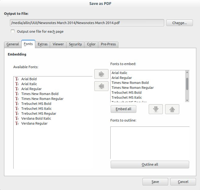
Fonts can vary from computer to computer. Even using very common fonts, things can go wrong. Times New Roman comes in various different flavours so you’re best to send your own. When you export as a .pdf, you can choose to embed fonts so that they print as you see them on your own computer. If there are any that you can’t embed, then you can choose to outline them. (This effectively turns text into images in the export.)
Bleed and Crop Marks
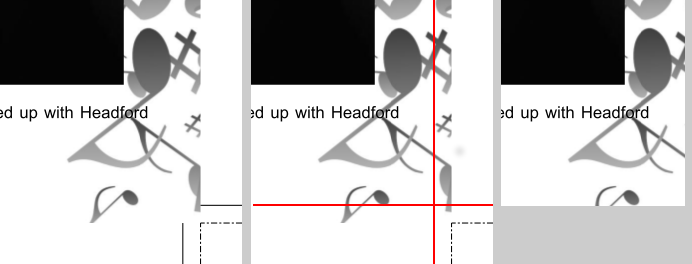
Bleed is the term for an over-run in the margin that allows for correct printing to the edge of the page. When a printer produces A4 printed to the edge of the page, they actually print on a slightly larger piece of paper and then cut it down to size. Both the printing and the cutting can cause the content to shift slightly so if, for instance, you have a dark background that goes to the edge of the page you can end up with a white line down one edge where the page has shifted during the process. In order to avoid this, you overrun backgrounds on the outside edges by 3mm or so to allow for this movement and get a perfect print. Below you can see the crop and bleed marks in the corner of a page in the left-hand image. In the centre you can see, in red, where the page is to be cut – the image goes 3mm beyond this off the page at the side and at the bottom. In the right image, the perfect cut – which you will normally get close enough to. I’ve only ever seen a page shift by around 1mm myself but it was enough to have a white line down the side of a black cover!
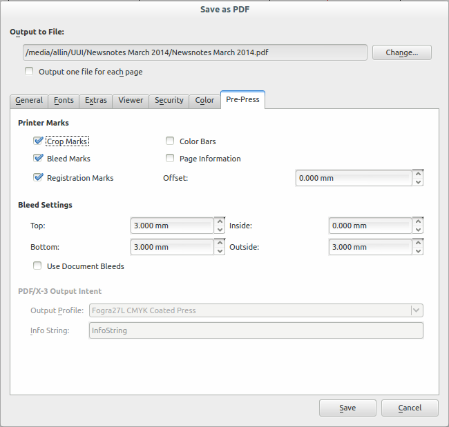
Bleed and crop marks are set up when you export the page. The panel below shows ‘registration’ as well but I’m not advanced enough to use it. (A note here if you are using Publisher, you have to set the export page size about 1cm greater than the page all around to accommodate the marks or it simply won’t export. Also, the default printer you have set can cause pdf export to fail – I usually set the printer to OneNote or a pdf printer to avoid trouble. The error messages with these faults are not very helpful!)
Another thing to note about bleed and crops in the box above is that bleed comes as inside and outside. For example, when you print an eight-page A4 document, it is usually printed and cut to A3 with page one and page 8 on a side as well as page 2 and page 7 etc. Obviously enough, you don’t want these pages overprinting each other with bleed so the inside edges have no bleed.
Image Resolution
Official print resolution, as I have always known it, is 300dpi. That is three hundred dots of ink for every inch of paper. Images that are set below this size in printed material become progressively less sharp to the point of pixelation (this can be a nice effect sometimes!) A good rule of thumb is that an image that appears clear on a computer at four times the size it will be in print will print fairly well. Scribus allows resolutions down to 144dpi before giving a warning but I tend to keep the resolution as high as possible. The way I generally check this before going to print is to make the pdf, open it and increase magnification to 400% and scroll through viewing all images. If they look pixelated or blurred, I decide whether to make them smaller or just drop them altogether.
Colours
OMG Colour! is probably a post that will appear on this site at some time. Leaving aside the matter of taste (which is a very big matter in itself), printing is fraught with issues in this matter. A few things to note:
- Colours printed on to different paper stock will most likely appear to be different. If the cover of a booklet and the inside are made of different paper, chances are the colours won’t match. Get a sample printed on the machine that will do the full print run to check.
- If you’re printing in black and white, then export to black and white in Scribus. If you are having black and white images in a colour publication, make sure they are black and white – colour pictures printed in black and white come out darker. If you’re unsure about the publishing software, make the image black and white in photo-editing software before putting it in the layout. (If you’re using Publisher, you should just make all images this way before putting them in – just choosing the colour options in pictures won’t do it!)
- What you see is not what you get. Computer screens use an RGB (red, green, blue) colour model and most printers you are likely to use a CMYK (cyan, magenta, yellow, key (black)) model. What you see on your computer screen is not what’s coming out from the printer. If in doubt, get a proof printed.
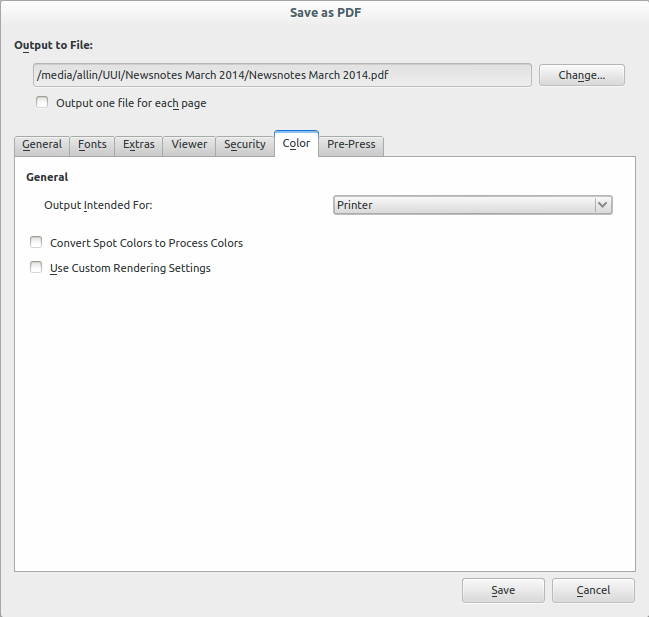
The output options below in Scribus are ‘Screen Web’, ‘Printer’ (colour print) and ‘Greyscale’ (black and white).
Layers and Transparency
When using layers and transparent images (including .png and .eps) in a document, you must be careful. I’m not really sure why it happens but it seems that different versions of .pdf are supported differently on different printers. Your best option here is to put any necessary transparency into images in an image editor beforehand and then flatten the image. I have had necessary logos disappear due to this issue so it’s one to watch out for.
As I’ve said elsewhere, desktop publishing is not easy. In fact, it can be a bit fraught. However, keeping in mind the things above you can in-source many small to medium jobs where the time in directing someone else to do the job would take longer than just doing it yourself.